Restaurant Rebrand in Montego Bay, Jamaica | Guestronomy Delight
When Guestronomy Delight, a popular restaurant and bar in Montego Bay, Jamaica, approached us, their challenge was clear: “Keep our Jamaican soul, make the brand look premium, and organise a multi-cuisine menu without confusing guests.”
As brand consultant, I led a 6–8 week rebrand that created a strong positioning, a bold visual identity, and a seamless menu system—delivering over 20 branded assets across interiors, signage, packaging, and digital touchpoints.
- Client Name: Restaurant Rebrand
- Company Name:Guestronomy Delight
- Project: Positioning · Visual Identity · Menu System · Interior/Signage · Packaging/Merch · Artwork Handoff
- Category: Hospitality · Restaurant & Bar
- Project Location: Montego Bay, Jamaica
- Turnaround time: 6–8 weeks
- Brand Consultant: Manish Vaishnav
Objective:
The objective of the rebrand was to elevate Guestronomy Delight into a premium yet approachable destination in Montego Bay by:
- Crafting a memorable identity system rooted in Jamaican culture without clichés.
- Streamlining the multi-cuisine menu to improve clarity and speed of ordering.
- Establishing a visual language (domino motif + colour coding) that could extend seamlessly across interiors, signage, packaging, and social media.
- Delivering vendor-ready artwork and pre-press checklists to ensure smooth production and reduce costly reprints.
What Made This Rebrand Work:
1) Positioning: Playful premium—Jamaican warmth meets Asian fusion, with hospitality at the centre.
2) Identity Hook: A domino‑tile graphic language—local, playful, infinitely repeatable across walls, menus, coasters, and social.
3) Colour Logic: Cuisine‑based channels for wayfinding: Red (Indian), Yellow (Thai), Green (Chinese), Black (Jamaican/Bar).
4) Menu System: Clear reading path: Category → Dish → Descriptor → Price; dietary icons and specials via QR.
5) Production Discipline: Grids, safe zones, and export presets that travel cleanly from paper to wall paint to packaging.
What I Actually Did (experience you’re hiring) :
• Led brand audit and competitor scan; mapped what truly drives pick‑up in this market.
• Defined brand narrative and tone that feel local yet elevated.
• Designed logo/wordmark and supporting icon set that telegraph fusion at a glance.
• Built menu templates with hierarchy tests in low‑light/bar settings.
• Directed interior & signage accents (domino patterns; colour bands for wayfinding).
• Created packaging & merch (coasters, mugs, lighters, take‑away boxes, bags).
• Delivered vendor‑ready artwork with a pre‑press checklist to avoid reprints.
Difficult Constraints I Solved :
• Celebrate Jamaican culture without defaulting to clichés.
• Keep multi‑cuisine offer clear, not chaotic.
• Ensure legibility at night (bar lighting) and on glossy surfaces.
• Enable seasonal campaigns without breaking the base system.
• Keep costs in check with repeatable, modular templates.
Outcome (qualitative proof)
• Memorability: Guests recognise and share the domino motif; it photographs well for social.
• Speed: Staff guide orders faster using cuisine colour cues.
• Consistency: Fewer back‑and‑forths with printers and fabricators; faster go‑live across touchpoints. > Quantitative metrics (Google reviews, table turnover, upsell) can be added if/when the client approves sharing.
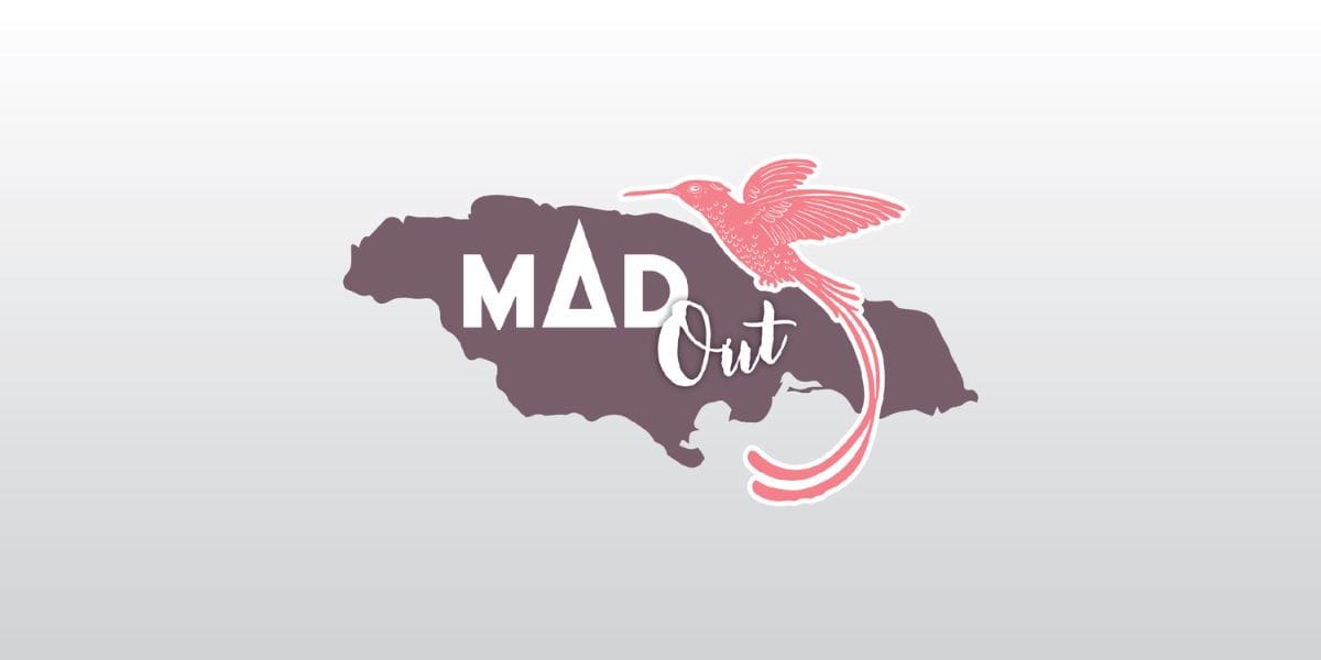
Case Study Branding of Fashion Boutique Mad Out (London)


Conclusion:
The branding for MAD Out by Manish Vaishnav exemplifies how thoughtful design can bridge cultures and communicate a rich heritage through contemporary fashion. This case study stands as a testament to the power of culturally inspired branding to make a profound impact on both the market and the community it aims to represent.
More Case Studies :


Unlock your brand’s potential
Schedule your Quick Call with Manish Vaishnav
![]()